|
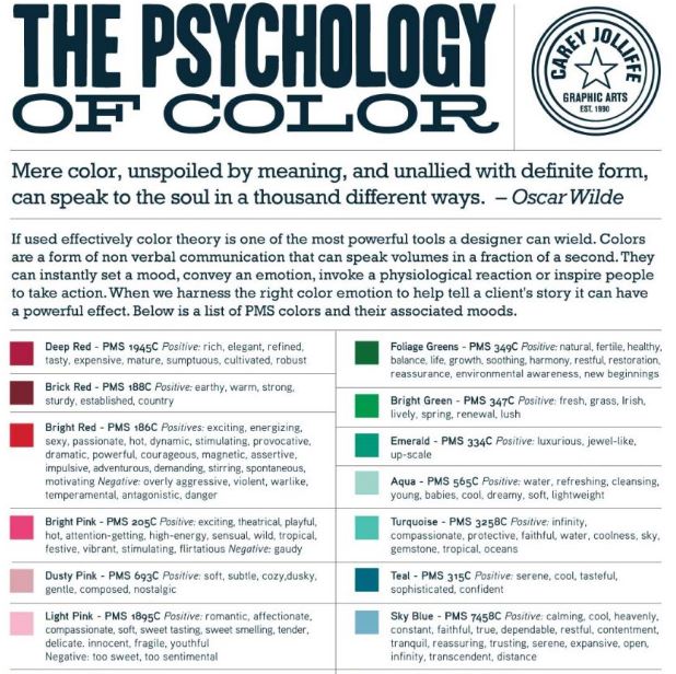
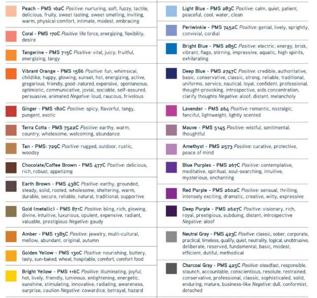
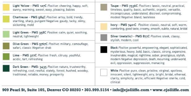
EVERYONE does it. Okay, anyone that matters anyway. Before i expound, look at the following logos: Logos above and analysis extracted from: http://themgroupcreative.com/logo-design-colors-guide-consumers/ Role of Colors: Colors are a key consideration in brand and logo development. The palette selected for the logo identity and supporting colors used throughout various communication pieces are intentional, whether to evoke emotion, provide visual cues or collectively tell a story. Emotions of Colors: We usually associate fast food brands with warm, bright colors because they catch our attention. Vibrant tones are, in fact, well received by just about everyone. Imagine if McDonald’s changed out the golden arches for muted blue ones. The restaurant would lose the pizzazz and immediacy of the promise. The arches would blend in with the sky and competitors’ brands would stand out and take the lead. (maybe that's why Taco Bell all but died out in Singapore) Blue represents security and solid stability. Because of this, banks often use blue in their visual brand marks. The light blue color Pepsi used in the Pepsi Refresh project was a nice modern blue, which stands for health, wellness, and balance. Such a cheater you are, Pepsi. As we all know, green has become a very important color and word in the last decade. Companies that want to be known as “green” often incorporate the color into their palette. On the other end of the spectrum, red is one of the colors most widely used in advertising. It is everywhere from fast food to lipstick, and red stands for passion, love, food, and vitality.
|
Mori.CaraDaughter. Sister. Archives
December 2021
Categories
All


|